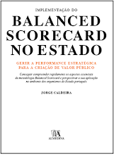
Livro - 100 Indicadores da Gestão

“Com este livro, o Jorge Caldeira deu um contributo valioso e necessário no campo da monitorização do desempenho dos dashboards e scorecards, bem como no domínio mais alargado da gestão da performance empresarial. O livro do Jorge Caldeira deve ser lido por gestores que ambicionam alinhar as suas organizações com a execução da estratégia corporativa e pelas chefias operacionais que procuram aumentar a produtividade e o desempenho”

Gary Cokins, Fundador, Analytics-Based Performance Management LLC

Fonte: Almedina

sexta-feira, 28 de janeiro de 2011

25 most used Key Performance Indicators (KPI)


1. Sales
2. Product category as % of total sales
3. Market share %
4. Gross Margin as a % of selling price
5. Average discount margin % of items sold
6. Average sales per customer
7. Profit per Customer
8. Nº of contacts with potencial clients
9. Success of contacts %
10. Duration from order creation to service delivery
11. Average profit per project
12. % of projects on budget
13. % of projects on time
14. % of projects with post-project review
15. % of projects with high risk profile
16. Clients debt
17. Average number of training hours per employee
18. % of employees gone through training
19. Average training costs per employee
20. R&D spend as % of revenue
21. % of very satisfied clients
22. Number of complaints
23. Defects per million opportunities
24.  % of action points derived from self audit, implemented within time planned
25. % of change controls reviewed vs implemented

Author: Jorge Caldeira

terça-feira, 25 de janeiro de 2011

Resistance to Dashboards?


  • You didn´t get much support from the board?
  • The middle management says that it´s very difficult (almost impossible) to measure some activities?
  • The information for the Dashboard always comes in late?
  • You implemented Dashboards a year ago and no one asked you to modify kpi?
  • Some of your users say that a target is better defined at the end of the year?
  • You feel that your Dashboard users don´t know exactly the kpi?
  • Some of your Dashboard users still ask "What is a Dashboard"?
  • When the Dashboard is available with a delay of some days, no one says anything?
  • When you feel that some information (results) is fiction!.
80% yes? You failed at implementing Dashboards! Sorry.

Author: Jorge Caldeira

quinta-feira, 20 de janeiro de 2011

Does everyone see Dashboards the some way?

Good top management: Now I can comunicate the corporate performance to everyone.
Bad top management: Now I can base my decisions on something!

Good middle management: Now I can antecipate problems and manage more efficiently.
Bad middle management: Now I have to work and and get some numbers.

Good workforce: Now they will see that I work a lot!
Bad workforce: Now I'm being supervised and I can´t spend more time on Facebook.

Do you know why? Dashboards improve transparency and supervision. Human beings don't like being controlled and always want to keep information to themselves. That´s life.

Is there a solution? Maybe. Try to show the advantages in dashboard implementation and don´t try to "hide" the disadvantages.

Author: Jorge Caldeira

segunda-feira, 17 de janeiro de 2011

I want to start building my Dashboard...


...and I don´t know anything about it.

Ok, this is your roadmap:
  1. Read some books. Dona wong, "The Wall Street Journal Guide to Information Graphics". Stephen Few, "Now You See It: Simple Visualization Techniques". Know how to read portuguese? Buy my book: "Dashboards - Convey Efficiently Corporate Information".
  2. Visit some good websites. Excel Charts; Sparklines for Excel;  Pictures of Numbers.
  3. Start improving your Excel skills. Take a class with Chandoo. See Peltier Tech Blog.
  4. Be creative. Get some ideas from HICHERT+PARTNER and Tableau.
  5. Consolidate your ideas about Dashboard design.
  6. Find a case. Open Excel. Start working on your Dashboard.
  7. Not sure about what you´re doing? Send me your work. I will tell you the truth.
Author: Jorge Caldeira

Do I need to get a designer to help me rearrange my Dashboard?

Well, if you:
  • know how to eliminate the elements that your graph doesn´t need to convey the message;
  • know how to mix the correct colours;
  • know what is important for your dashboard users;
  • don´t like 3D effects;
  • don´t think shadow is an inportant aspect to use in your graphs;
  • don´t forget that the message is more important than the art (design);
  • believe that simplification is a priority issue.
  • if elegancy is your middle name.
you can do it yourself.

But don´t forget, not everyone sees design the same way.

Author: Jorge Caldeira

Ok! You also want a bullet graph in excel.

Here is the link to download the excel bullet graph.


Tell me what you think.
 

domingo, 16 de janeiro de 2011

Gauges! Do you want one in excel to use in your reports?

Stephen Few doesn´t like them, but believe me, it helps to conquer an organization! Then you can return to the best design practices.


Download now: GAUGE in Excel

sábado, 15 de janeiro de 2011

The importance of Design in 2nd generation Dashboards

Design will:

  1. Allow to convey more information than usual, without it becoming confusing.
  2. Allow information to be conveyed more clearly and, consequently, the Dashboard will convey, almost instantly, how the organization is performing.
  3. Allow the Dashboard to be more objective and useful.
  4. Allow the Dashboard to guide its user in the reading and analysis.
  5. Transform a report into an attractive means, able to conquer its users.
Author: Jorge Caldeira

Definition of Dashboard

What is a 2nd generation Dashboard:
  1. Presents the main drivers of the organization’s activity on a single screen/page – giving instantaneous information and integrated vision.
  2. Comunicates, preferentially, through graphs.
  3. Uses basic methods of design to convey the information efficiently.
  4. Enphasizes what really is important.
  5. Guides the user through its reading.
  6. Combines the information efficiently under different perspectives, in order to expose relations which would be hard to detect individually.
  7. Uses a creative, simple, direct and elegant design.

 Author: Jorge Caldeira

sexta-feira, 14 de janeiro de 2011

Curso e-Learning de Dashboards

Caros Amigos,

através da Verlag Dashöfer vou realizar a 2ª edição do curso de formação em e-Learning - sobre Dashboards.

Dashboards: Comunicar eficazmente a Informação de Gestão (2ª edição)

Objectivos do curso:

- Sensibilizar para as vantagens dos Dashboards;
- Alertar para os factores críticos da comunicação gráfica da performance;
- Capacitar para o desenho de Dashboards;
- Conhecer os novos modelos de Dashboards.

O curso tem início a 11 de Março de 2011  e termina a 12 de Abril de 2011.
(Não é presencial, pode participar de qualquer parte do nosso Planeta! ; )

Veja mais informações em: http://formacao.dashofer.pt/index.php?option=com_content&task=view&id=492&Itemid=56

Chandoo Dashboard #2

Mais um Dashboard da autoria de Chandoo. Este foi construído como prenda para um dos principais intervenientes do forum de discussão - Hui.


- O forum recebeu  5,227 posts, dos quais o Hui contribuiu com 24% (1 em 4).
- Hui demora em média 13h30m para responder.
- A sua resposta mais rápida demorou 31s.
- Em Novembro respondeu 19 vezes por dia.
- Etc.

Fonte: http://chandoo.org/